THG Institute
(Art direction, UX/UI, digital design)
PROJECT OVERVIEW
After going through a rebrand and strategy realignment, The Hut Group wanted to launch a tech training programme for graduates: THG Institute. They needed a website to promote the course and some print and digital marketing activity to help with recruitment.
MY CONTRIBUTION
I worked as a part of the THG rebrand team and was selected to lead design and art direction for this project. It was a start to finish project and I worked collaboratively with other designers, content producers and developers to create brand assets, design and develop the website and produce other deliverables.

Project goals

Create an attractive branding for the Institute, in line with the recent core THG rebrand

Deliver a relevant, well structured and clear website built on a CMS

Produce a large number of brand assets to be used across all communication channels
Brand design
The Institute had to align visually with its parent brand THG, while having its own merit and appeal to a different audience. THG brand used flow fields as a visual device, which represented attraction of the outside world and emphasised momentum, forward motion, ambition and growth. For Institute, the flow fields appear zoomed in, more immersive and closer to the core of what the company is all about.


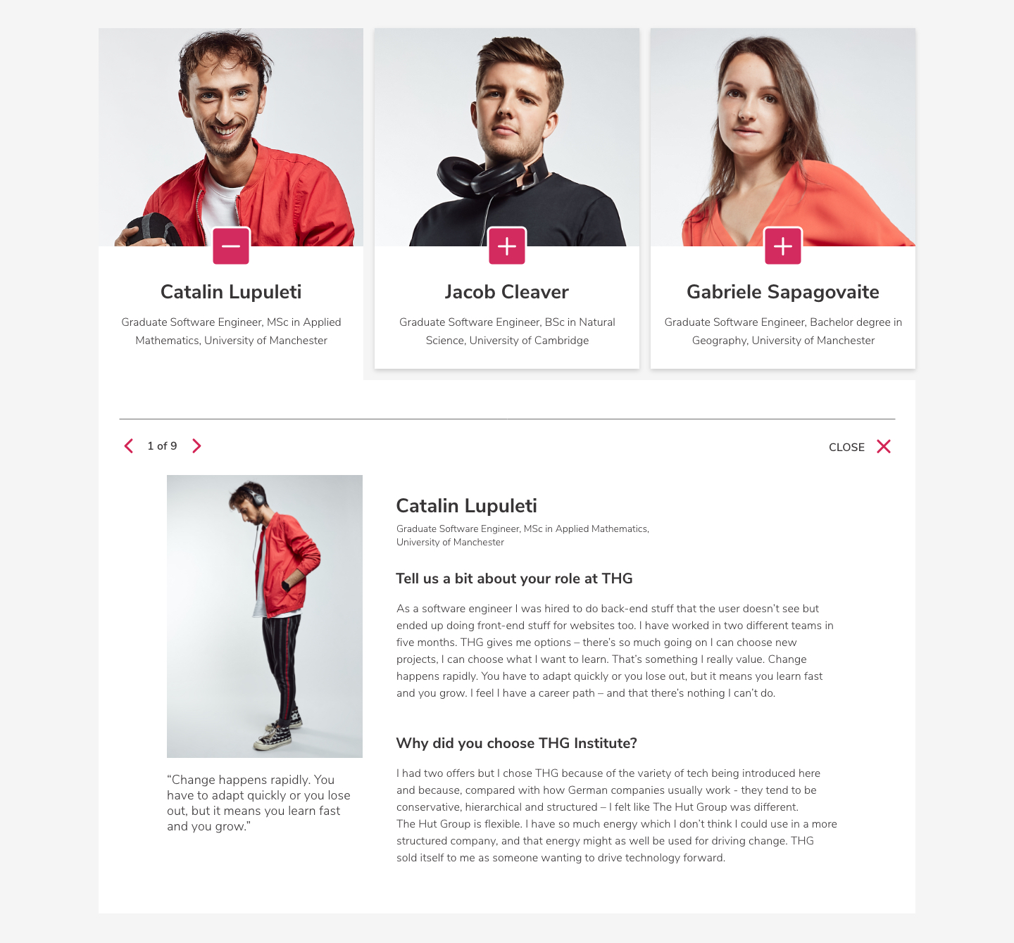
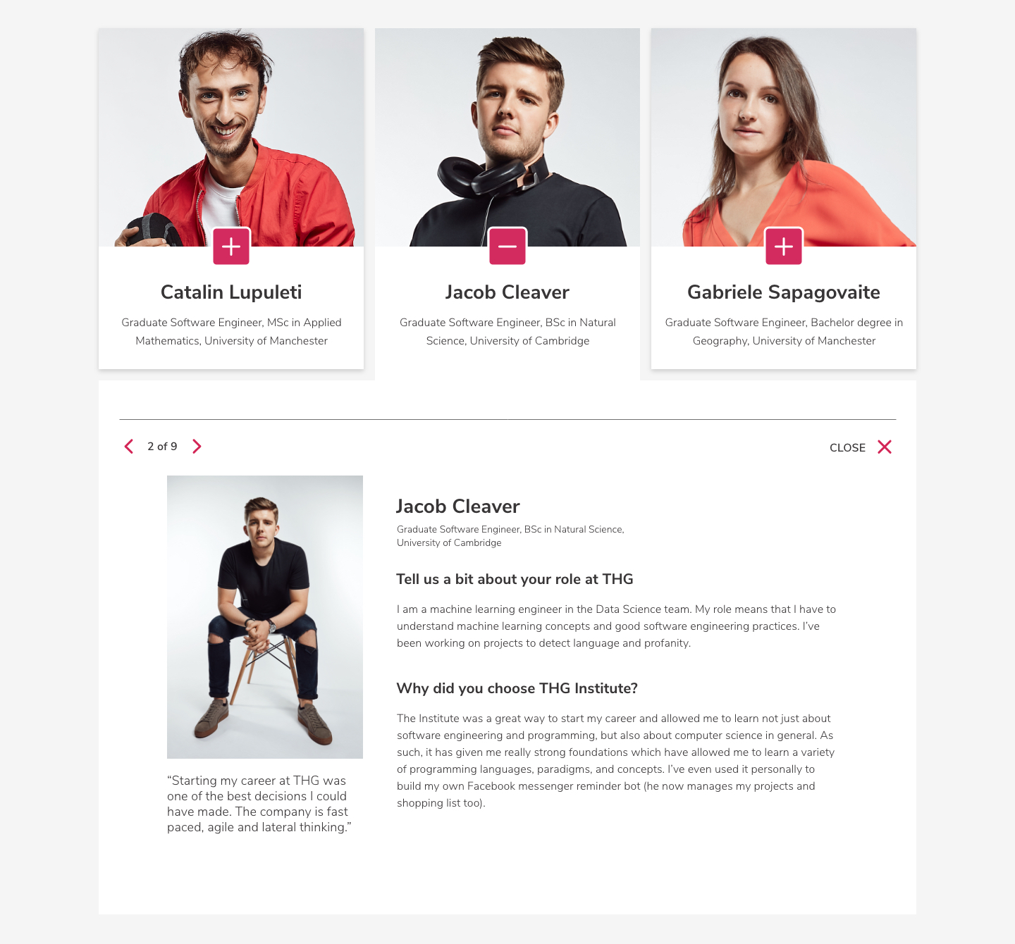
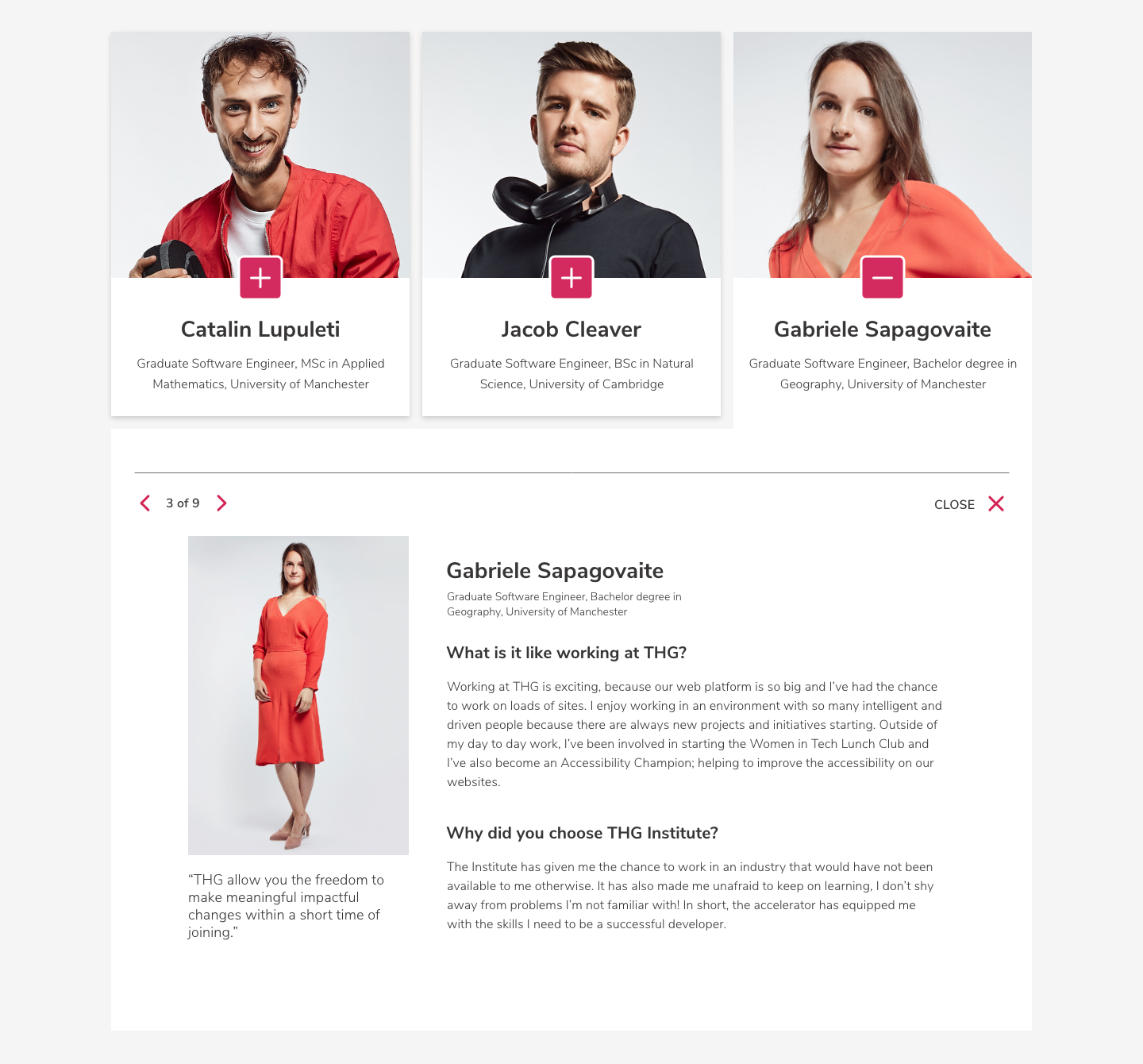
Photography
I focused the photography on graduates working in THG Tech division, which allowed us to tell compelling stories and create social proof to attract future applicants. During the shoots I encouraged authenticity in styling, attitudes and behaviours so it can be reflected in the final, user-facing assets.

Website design
With a brief to create a site that’s simple, clean and easily amended through the CMS, I opted for white & greys, with strong, bold pops of colour from flow fields and navigational elements. The CTAs were purpose oversizes and used goal-oriented language. I wanted the content to be accessible and to ensure that the people stories remain a strong focus.

Digital marketing & OOH
Digital marketing activity followed the visual style and focused on eye-catching visuals and strong, plain messaging.


SEE NEXT CASE STUDY