THG Ingenuity
(Brand design, art direction, UI design)
PROJECT OVERVIEW
After going through a rebrand and strategy realignment, The Hut Group launched their e-commerce platform as an end-to-end solution for businesses. They needed a brand design that was tech-focused but still fitted with the core THG branding, as well as a product website.
MY CONTRIBUTION
I worked as a part of the THG rebrand team and was selected to lead design and art direction for this project. It was a start to finish project and I worked collaboratively with UX designers, content producers and developers to create brand assets and to design and develop the website.

Project goals

Create a technology-focused branding, in line with the recent core THG rebrand, that stands out in the tech category

Deliver a relevant, well structured and clear website built on a CMS

Produce a large number of brand assets to be used across all communication channels
Brand design
THG Ingenuity had to visually align with its parent brand THG, while having its own merit and appeal to a different target audience. THG brand used flow fields as a visual device, which represented attraction of the outside world and emphasised momentum, forward motion, ambition and growth. For Ingenuity, the flow fields are very enlarged to represent the very core of THG, which built its success on the technology platform.


Photography
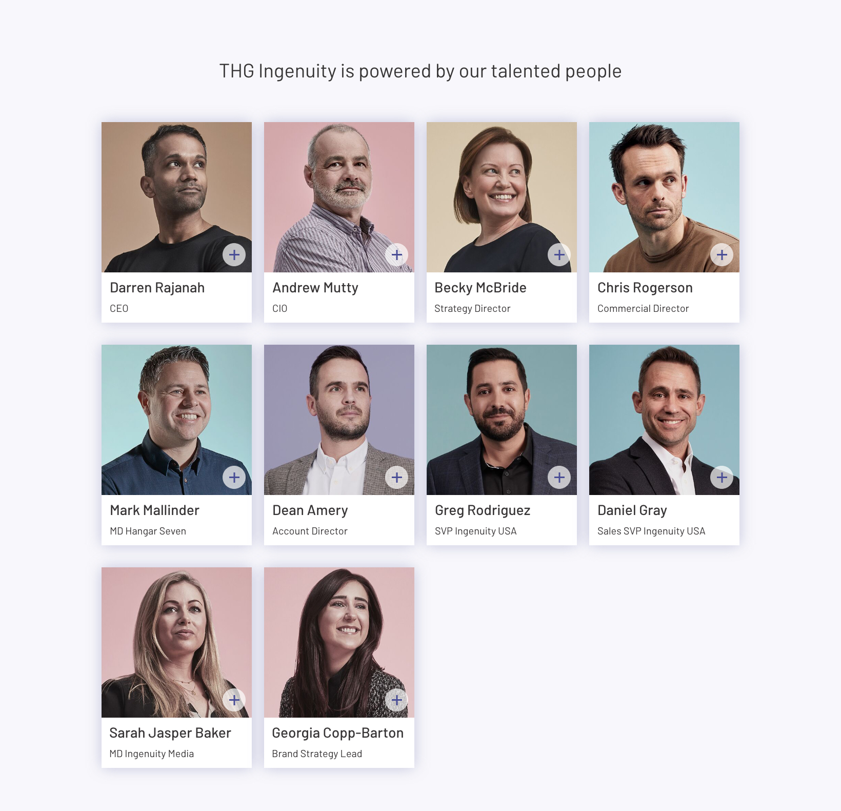
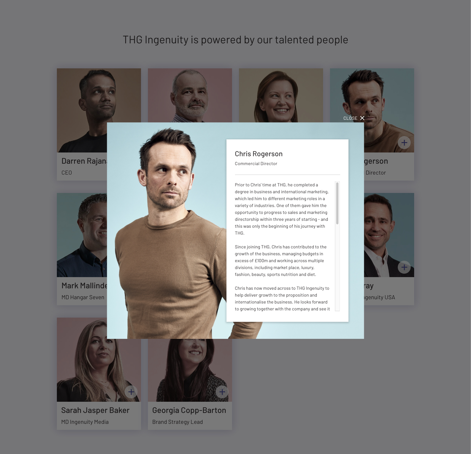
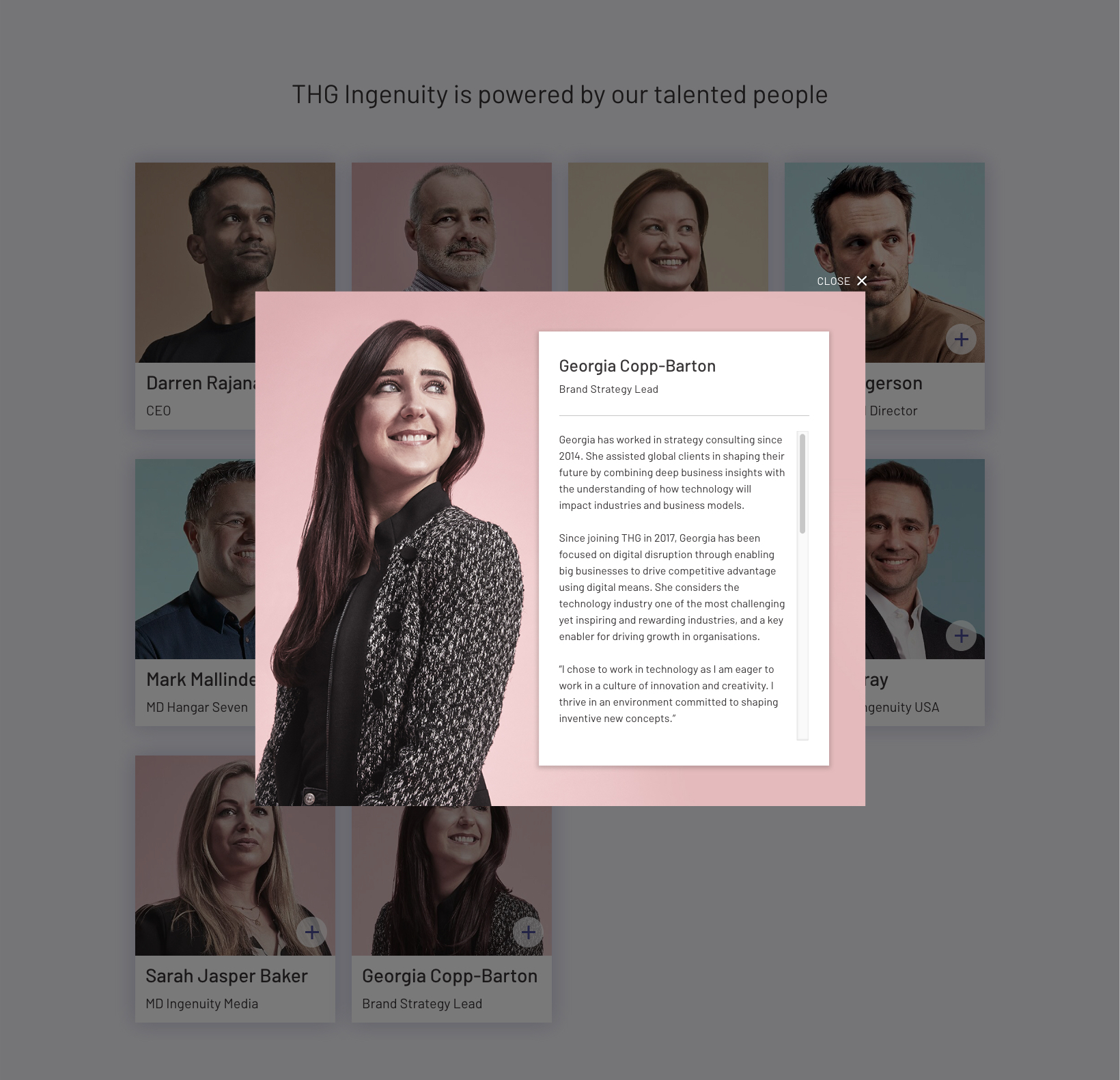
I art directed a series of portraits with the Ingenuity executives. During the shoots I conducted interviews to create content for web and social channels. The styling emphasised authentic and natural look, with slightly stylised poses communicating confidence. The pastel colour palette differentiated Ingenuity from other tech brands and provided a nod towards the luxury and beauty brands of THG.

Icons design
I designed a full suite of icons to be used across the site. They are subtle and with modern feel, highlighted by a contrasting pop of neon colour.
Website design
With a brief to create a site that’s simple, clean and easily amended through the CMS, I opted for white & greys, with strong, bold pops of colour from flow fields and navigational elements. The CTAs were purpose oversizes and used goal-oriented language. I wanted the content to be accessible and to ensure that the people stories remain a strong focus.

SEE NEXT